Editor's Note
This editor’s note highlights the key facts and market implications behind “Kitchen Tiles 2026: Mosaics and Patina Cladding “, with emphasis on sourcing, product fit, fabrication, logistics, or buyer impact.
In the tile and cladding sector, this translates for the professional into "glazes with depth, colors with nuance, with substance and richness." Pieces with subtle destonification are therefore in vogue, moving away from light and perfect tones, highlighting the product's artisanal origin: "Color as the result of the process, technique, and craft, avoiding quick or easy trends." According to López, this is the only way to create a space that ages well and offers that charismatic patina, responding to the coldness of the interiors we left behind in 2026, "excessively correct, but empty of identity."
Color as Identity
“Color returns not from superficial aesthetics, but as an act of identity and expression,” says Damián López, creative director of the leblume studio and the artisanal cladding company todobarro.
"We champion colors to speak of local identity, of the culture of the place where they are, of tradition and also of contemporaneity. Colors to break with non-places, with those neutral interiors that could be in any city in the world; with those interchangeable spaces, without roots or context. Colors to break with the status quo, to look back at the territory, to return to the essence," he continues.
A Space for Creativity
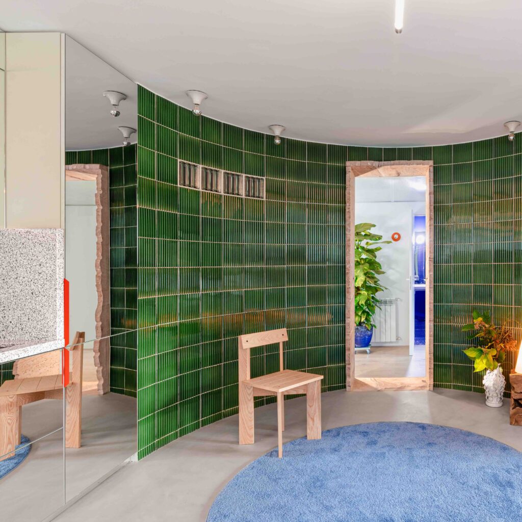
If the kitchen is a creative place, why do we insist on it being aseptic? That's the question posed by the creative director of todobarro, who advocates for an interior design that elevates kitchens to "stimulating and fun spaces, that activate you, where things happen."
It's a trend also detected by Herranz:
“In 2026, kitchens are filled with warmth and naturalness. Cold and overly neutral spaces are left behind to make way for more welcoming and pleasant environments,” she says.
To achieve this, earth tones ("beige, sand, taupe, soft browns and creams, easy-to-combine colors that never go out of style") and touches of intense grays or greens, used in moderation, will be chosen. "They are applied mainly on a feature wall or the backsplash, to give personality and depth without overloading the space."
Without neglecting functionality, López appreciates that the trend is moving, as in the rest of the house, towards creating real kitchens:
“A kitchen to get your hands dirty and make a mess, not a ‘catalog’ kitchen, where it seems like something has never been cooked.”
Or, in other words: "We want the kitchen to stop being understood as a display space and become a lived-in place again, where imperfection adds authenticity. Less Glovo and more frying yourself an egg for dinner."
Straight to the Essence
Sustainability, always on everyone's lips, is not just about acquiring materials from ethical sources that are easy to recycle; it's also about creating interiors with a timeless vocation. "The ideal is to seek a balance between color and tiling, avoiding the typical ubiquitous pattern that everyone will tire of in three months," indicates López.
It's an opinion with which Herranz also agrees:
“The tile stops being just a discreet background and gains more prominence. Artisanal-look finishes are in vogue, with slight color variations, irregular edges, or a handmade effect. Geometric patterns are still present, but with softer and more balanced designs, intended to decorate without tiring.”
The remedy, therefore, lies in a return to the essence, "to simple and timeless geometries," according to the todobarro expert, who refers to basic formats like the square, the vertical 20x5cm rectangle, or even smaller formats, like the 10x2cm malleated.
Two winning tips: "Play with the joints and the imperfections of the material itself to create maximum naturalness," and design starting from a concept linked to the place or local culture. "In case of introducing more personality-filled tiling, it's better to opt for patterns that are not gratuitous, that have a reason."
A perfect example is found in this Valencian house by Viruta Lab, which uses checkerboard tile as a nod to the typical pattern of the Cabanyal neighborhood where it is located.
What is seen in stores day-to-day, however, has to do with more practical matters:
“Matte or satin finishes clearly win over glossy, as they reflect less light, hide marks better, and provide a more natural feel. Tiles with soft reliefs or small 3D effects are also trending, adding texture without overloading the kitchen,” points out Herranz from Leroy Merlin.
The Imitation Debate
No matter how many years pass: designers will always bet on original materials and avoid those that try to emulate others, although in everyday life many people use them.
This is something Herranz detects, whose work involves daily contact with what end users ask for:
“Ceramic and porcelain kitchen tiles remain favorites for their resistance and easy cleaning. In 2026, designs that imitate natural materials like stone, marble, cement, or wood stand out, but in warmer and more pleasant-to-the-eye versions,” she says.
She even mentions adhesive and PVC claddings, which continue to grow as a practical option for quick renovations.
Source: Read the original article | Published: February 06, 2026